#Before moving on to Fourth Visualization
The disadvantages of the former scatter plot were enhanced and overlapping parts were removed. But still, there was a lot of wasted space because it was expressed on the map.
To solve this problem, we had to create a simple, space-maximizing graph. At the same time, the graph had to include information about the location.
#Process
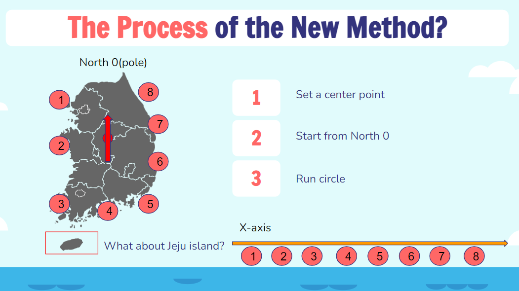
Our process consists of three steps in total. First, find the center on the map of the coastline. Then, starting from its center, it finds 0 degrees north latitude. Then, rotate the circle once and list the points at which the data are displayed in order. Place the listed order on the x-axis and make a bar graph. Then, on the x-axis, as you can see on the right, it will appear as an order of these numbers.
However, we have a Jeju island which is not our inland coastal line. This will be discussed in the R Shiny output.
#Modify data frame following the "Process"
#df is the name of assigned dataframe
unique(df$location)

country <- c("인천백령도 사곶해안","강화여차리갯벌","인천영종도 용유해변","인천덕적도 서포리해변", "안산말부흥",
                 "태안백리포","태안안면도 바람아래해변","보령석대도","사천아두도","사천다사항해변",
                 "부안변산","고창동호해변","영광백바위해변","신안임자도","진도하조도","신안고장리해변","해남예락해변",
                 "해남송평해변","해남묵동리","완도신지도해변","고흥신흥","순천반월","여수백야도해변","여수백야도해변",
                 "남해유구해변","통영망일봉","거제두모몽돌해변","마산봉암갯벌","부산해양대","울주진하해변","울산대왕암",
                 "포항구룡포 대보해변","포항칠포","영덕고래불해변","울진후정", "동해노봉해변","강릉송정","속초청초")
df1 <- data.frame(country)

df <- df %>% rename("country" = "location")

df <- right_join(x=df1,y=df,by="country")

df <- df %>% rename("location" = "country")

xform <- list(categoryorder = "array",
              categoryarray = c("인천백령도 사곶해안","강화여차리갯벌","인천영종도 용유해변","인천덕적도 서포리해변", "안산말부흥",
                                "태안백리포","태안안면도 바람아래해변","보령석대도","사천아두도","사천다사항해변",
                                "부안변산","고창동호해변","영광백바위해변","신안임자도","진도하조도","신안고장리해변","해남예락해변",
                                "해남송평해변","해남묵동리","완도신지도해변", "고흥신흥","순천반월","여수백야도해변","여수백야도해변",
                                "남해유구해변","통영망일봉","거제두모몽돌해변","마산봉암갯벌","부산해양대","울주진하해변","울산대왕암",
                                "포항구룡포 대보해변","포항칠포","영덕고래불해변","울진후정", "동해노봉해변","강릉송정","속초청초"))
The code assigns the order we want to organize to the country. Make it as a data frame, and join it with the original data frame, but as a right join. Then it will be organized in a customized order. Change country to a location.
For the final visualization result, we will conduct it in a
#UI part
ui <- fluidPage(
  theme = shinytheme("darkly"), tags$head(tags$style('body {color:#EFFFE9;}')),
  titlePanel(h1("Group Assignment CDS301", align = "center"),  windowTitle = "Plot3"),
  fluidRow(width=12,
           sidebarLayout(
             sidebarPanel(width = 3, style = "position:fixed; width:inherit;",
                          tags$head(
                            tags$style("body {background-color: #303030; }")),
                          selectInput("year",h2("Plot - Select Year"), c('2008','2009','2010','2011','2012',
                                                                         '2013','2014','2015','2016','2017',
                                                                         '2018','2019','2020'), selected = "2020"),
                          helpText(h4("You can choose one of years.")),
                          br(),
                          br(),
                          helpText(h3("About"),tags$br(),"The dataset is retrieved from 한국공공데이터포털",tags$br(),
                                   "The visualization is created by Minsu Kang.",tags$br(),
                                   "Published in 2022 November 28.")
             ),
             mainPanel(tags$head(
               tags$style("body {background-color: #2EC4B6; }")),
               br(),
               plotlyOutput("plot", height = "1000"),
               br(),
               br()
               ))))
Here is the UI of the HTML file. There is the body, title panel, and sidebar panel for input. The format of the input is a select drop-down box. Then here plotly output is named as plot.
#server part
server <- function(input, output) {

  dataInput <- reactive({
    if(input$year == '2020'){
      df
    } else {subset(df %>% filter(df$year == input$year))}})

  output$plot <- renderPlotly({
    plot_ly(dataInput(), x = ~location, y = ~EA, type = "bar", name = "EA") %>% add_trace(y = ~kg, name = "kg") %>%
      layout(title = list(text = "<b>Marine Debris Analysis<b>", font= list(family = "Times",
             size = 25, color = "#E71D36"), y = 0.98, x = 0.5, xanchor = 'center', yanchor =  'top'),
             font= list(family = "Arial", size = 20, color = "#011627"),
             xaxis = list(title = "<b>Location</b>", zeroline = T),
             yaxis = list(title = "<b>Quantity</b>", zeroline = T),
            showlegend = T,
             legend = list(title = list(text = "<b>Unit</b>")),
             plot_bgcolor = '#EFFFE9',
             paper_bgcolor = '#EFFFE9'
      ) %>% layout(xaxis=xform) #%>%  dd_segments(x = 15)
    })}
#Execute the code
shinyApp(ui, server)If you execute this shinyapp function,
#Fourth Visualization
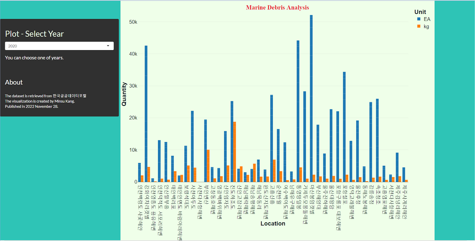

First, hard to see a one-look location, It gives spatial data but hard to estimate the globe location as a user.
Second, it is hard to deal with the island. We dealt with island data consider as another inland data and attached end of the x-axis. Another method we can use is to make a separate plot for the island.
#Something to improve
If we want to add a vertical line, you should approach it numerically in the process of transferring the initial process to coding. Since it is impossible to add a line to the regional variable, the x-axis should be constructed with a new quantitative variable based on 0 degrees north latitude. It would be a better visualization if you could show the reference line of the east coast, west coast, and south coast through the vertical line and show the reference line of the island.
'I studied... > Done' 카테고리의 다른 글
| Marine Debris Final Code (1) | 2022.12.16 |
|---|---|
| Interactive Visualization: Marine Debris on the Korean Peninsula - 3 (0) | 2022.12.16 |
| Interactive Visualization: Marine Debris on the Korean Peninsula - 2 (0) | 2022.12.16 |
| Interactive Visualization: Marine Debris on the Korean Peninsula - 1 (0) | 2022.12.15 |


